
Last week, ESPN’s Jim Caple came out with a ranking of the best and worst uniforms in baseball and came under fire for putting the San Diego Padres last because of their military uniform. However, he also had a few missteps ranking the classic Washington Nationals in the bottom five, while putting the horrendous Miami Marlins in the top 10. He also alleged that his rankings were purely based on each team’s home uniform alone, but proceeded to include a critique of each team based on their alternate uniforms.
This got me thinking: What team has the best total uniform repertoire in the major leagues? So, I came up with a ranking system basing each uniform a team has designated for the year 2012 (excluding the one-time throwbacks or holiday uniforms).
The point system works like this:
-13 — great uniform
-12 — good uniform
-01 — above average
-10 — breaks even/good parts and bad parts
0-1 — below average
1-2 — ugly uniform
1-3 — eyesore
I then calculated the total score and divided the earned points by the possible amount of points to determine a “greatness percentage.” This way, a team like the Rockies with five possible uniform combinations would be judged on the same basis as a team like the Yankees that only has two uniform options. Basically, what I am looking for in a uniform is an original home uniform with a road uniform that is either a mirror image of the home, or a sharp uniform that plainly says the city name. Alternates should also be as similar. Hats come into play, as well. Any ties really came down to my own biased judgment, but overall, this was an effort to ensure that no matter what day it is, no matter where a team is playing, the best aesthetic product was on the field.
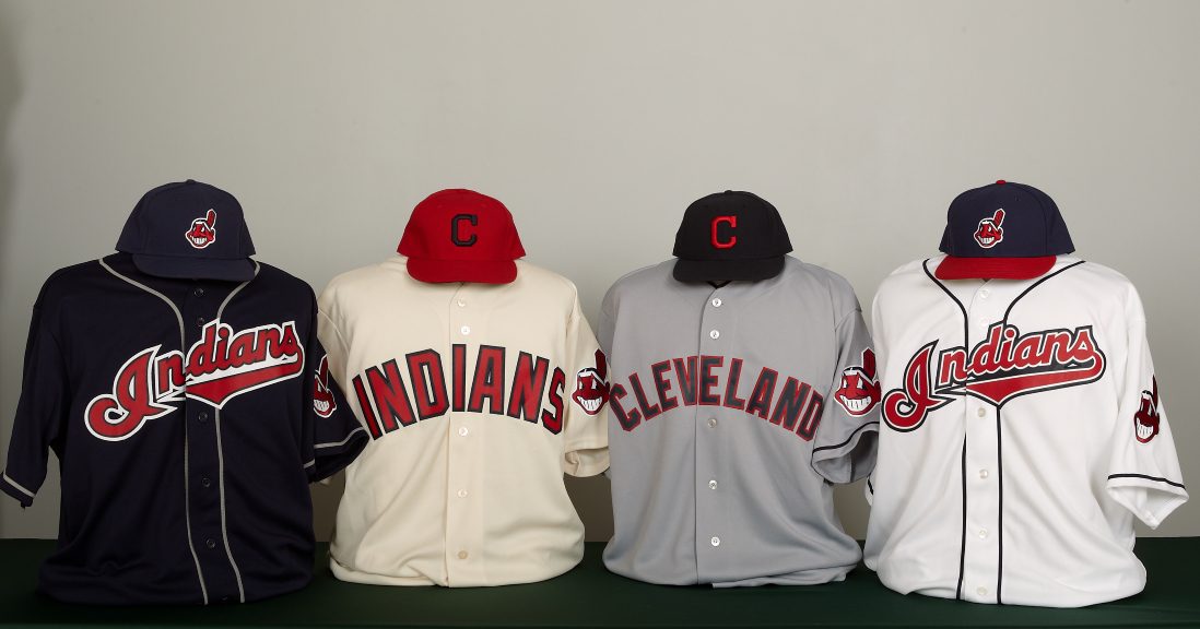
30. Cleveland Indians: 6% uniform greatness
Home 0; Road -1; Alt Home 1; Alt Blue 1; Classic 0
Right from the start: This is not because the Indians logo could be considered racist. All that aside, these are unoriginal, over-caricaturized or otherwise boring uniforms. The Indians have four different uniform combinations: a home uniform with a script “Indians,” a road uniform with a block-letter “Cleveland” that is an attempt at a throwback, an actual throwback that acts as an alternate uniform, and their usual blue alternate, which is worn both home and away. Make up your mind, Cleveland. I would suggest going back to the drawing board altogether. The throwbacks are too bland and the home version looks mismatched with blue socks. The more modern uniforms are trying a little too hard to be clever with an “I” in the shape of a headdress feather and have too many colors. Cleveland has the opportunity to be creative with what they have and maybe return to a red uniform while still having a classy uniform, but instead they go with dark blue. The MLB has seen enough of that.
29. Tampa Rays: 6% uniform greatness
Home 1; Road 1; Alt Blue 0; Alt Light -2; Classic 1
The Rays uniforms are pedestrian and lazy. They have a good idea moving from the green to a more ocean-centric blue, but the home and away uniforms are safe and indistinct with a bland “TB” logo on the hats. The dark blue alternate is understandable, but the blue numbers on blue shirts doesn’t work. They need to better employ the light blue outline. As for the light blue uniforms, they are too bright for a team that plays in what essentially looks like a parking garage. Give them a classic point for the stripped socks.
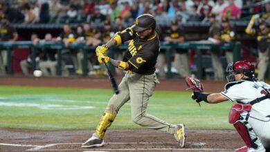
28. San Diego Padres: 13% uniform greatness
Home 0; Road 0; Alt Army 0; Alt Blue 1; Classic 1
Poor Padres. They have never had a good-looking uniform and it is not because they wear camouflage on Sundays (which is really so they can seem as absent on the field as they do in the standings), but because their uniforms are all incredibly boring. I actually like the evolution of the military uniforms they have been wearing, but if they would wear something as creative as that every day, they might come up with something praiseworthy.
27. Miami Marlins: 20% uniform greatness
Home 0; Road 1; Alt Orange 2; Alt Black 0; Classic 0
I don’t mind what the Marlins tried to do by incorporating the colors of a coastal Miami sunset into their uniforms, but with all the options they had to go from historically – even as a minor-league franchise – this uniform breaks-even in a classic rating. The lettering on the black, road and orange uniforms all use this sunset lettering throughout, but the black-heavy home uniform doesn’t. Furthermore, why doesn’t the home uniform say “Marlins” like the orange one does? A lot could have been done with this but wasn’t.
26. Arizona Diamondbacks: 20% uniform greatness
Home 0; Road 2; Alt Red 0; Alt Black -1; Classic 2
Missed it by that much, Arizona. Good job moving away from the awful green and purple uniforms of the 1990s and early 2000s in favor of a red scheme – which matches with Arizona neighbors the Cardinals and Coyotes – but really? D’Backs? Every logo you have – the diamond-backed “A”; The snake “D”; The rattler-head “DB” – are all really clever and unique, and you couldn’t find a better way to incorporate them than as a sleeve logo and the breastplate of a really horrid black alternate? Give it one more try.
25. Kansas City Royals: 33% uniform greatness
Home 2; Road 2; Alt Blue 2; Alt Blue -2; Classic 1
The Royals uniforms are safe yet historic, but with a blue and white spectrum there isn’t much more that can be done. The simple script home uniforms are sleek and classy, and the road employs a trend toward using the city name on travel uniforms. For alternates, the royal blue is obvious, but the light blue attempts to replicate the George Brett road blues and fails. Stick to one alternate.
24. Atlanta Braves: 33% uniform greatness
Home 3; Road 1; Alt Home 3; Alt Red 0; Alt Blue -3; Classic 2
The Braves are killing me. If it wasn’t for the awful new blue uniforms introduced in 2008, they would easily be the best uniforms in baseball. They also now use the same solid blue hat with the road uniform, tainting those, as well, by replacing the top-selling hat in baseball as of 2007. However, if you’re catching a game at Turner Field this year, you will be seeing a well-dressed team without question. Not only are the standard home uniforms one of the best of all time, but they have also introduced a crème-white alternate – sans tomahawk underline – on weekends that is rather sharp, and thus move the red alternates to Friday nights. Just avoid the blue road hats.
23. Houston Astros: 40% uniform greatness
Home -1; Road 1; Alt Red 3; Alt Home 2; Classic 1
If the Astros could get as much of the black color out of their uniforms as possible, their look would improve exponentially. They started to do so in 2011 by wearing their red alternate hats with the road uniform, which better matched the red script “Houston,” but they still wear black hats with black pinstripes on their default home uniforms which aren’t nearly as sharp as the alternative options they have.
22. Colorado Rockies: 44% uniform greatness
Home 1; Road 2; Alt Home 0; Alt Black 2; Alt Purple 1; Classic 2
The reason the Rockies employ so many alternates is because their home uniforms are just a bit too bland, but with so many alternates, the alternate home vest uniform is just overkill. Pick one. The road uniform is their best, and the alternate black vest and purple are both original and nicely reflect the backdrop of the Rocky Mountains.

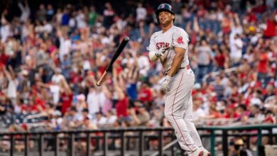
21. Boston Red Sox: 47% uniform greatness
Home 3; Road -2; Alt Red 1; Alt Blue 2; Classic 3
Despite Boston’s home uniform being one of – if not the – best uniforms in baseball, they fall tremendously short with the new road uniforms they introduced in 2009 effectively replacing one of the sharpest road uniforms at the time. They are boring, repetitive and even worse: They reflect a uniform that was worn during the Bill Buckner game. The Red Sox have not won a playoff game since making the switch. Coincidence? The only redeeming quality is the dangling sox patch on the sleeve, but it only appears on that one uniform. The Friday blue road alternate is an obvious reflection of the typical road jersey, but the red is rather plain. It needs piping like the first red alternate which was introduced in 2003.
20. Detroit Tigers: 58% uniform greatness
Home 3; Road 2; Classic 3
Kudos to the Tigers for avoiding the obvious blue and white or blue and orange alternate uniform, but only one of their two uniforms is particularly sharp. The home uniform with a crisp blue piping and classic “D” insignia on the breast need not be reflected in the road uniform, but the blue “Detroit” script outline by both orange and white is too much. A solid orange outline would be nice and reflect the orange cap insignia used with the road uniforms.
19. Minnesota Twins: 60% uniform greatness
Home 1; Road 1; Alt Home 3; Alt Blue 3; Classic 1
When they moved into the new Target Field, the Twins reintroduced an off-white uniform and its road counterpart as their primary home uniform and default road uniform. The home is excellent in that it is both historic and compliments the sandstone color of Target Field, and, although the road is a nice inverse to this, it alters its archetype in that the lettering is blue, whereas the original was red. The biggest problem is that the Twins have yet to retire the white pinstriped home uniforms of Kirby Puckett’s era that worked well in the Metrodome, but not in outdoor Minneapolis.
18. Seattle Mariners: 67% uniform greatness
Home 3; Road 3; Alt Teal -1; Alt Blue 2; Classic 3
What is it with Seattle and bright, ugly uniforms? Probably the worst professional uniform in recent memory is the Seahawks’ lime-green uniforms against the Bears in 2009 and now the Mariners have followed suit with the resurgence of a teal home alternate. Personally, I like their blue alternate and would rather see that on a Friday night at Safeco Field before anything else, but their home and away uniforms draw no complaints and their logo is an adept blend of city and symbol, with the S surrounding a compass rose. I am also a sucker for a classic color scheme that replicates itself in multiple teams in a city.
17. Texas Rangers: 67% uniform greatness
Home 2; Road 2; Alt Red 1; Alt Blue 2; Classic 3
Rangers uniforms are a walking Texas flag, and why shouldn’t they be? However, they mix and match far too often. When worn with the white home uniforms the red hats clash with the blue lettering and it is not nearly as crisp as the red-on-red or the blue-on-blue. When worn at the appropriate times, the Rangers uniforms are pretty sharp, particularly with the alteration of Ranger-style font added to the nameplate and numbers.
16. Los Angeles Dodgers: 67% uniform greatness
Home 3; Road 3; Classic 2
Dodger blue is one of my favorite colors. Unfortunately, being from Boston, it is the same color as New York Football Giants blue and that is exactly where the Dodgers belong: New York. Both the home and away uniforms are great, but only a good rating for having “Las Angeles” on the chest. Brooklynites wouldn’t leave in the seventh.
15. San Francisco Giants: 67% uniform greatness
Home 3; Road 3; Alt Orange -1; Classic 3
In trying to stay true to the math, the Giants really suffer from this new orange uniform. It is a good try, and I particularly like the orange-brim hats on Sundays, but it would complement the off-white home uniforms as well as it does when worn on the road.
14. Baltimore Orioles: 67% uniform greatness
Home 2; Road 3; Alt Orange 0; Alt Black 2; Classic 3
The Orioles have altered their uniforms for each of the last few years and finally moved away from the ugly, anatomically correct bird insignia in favor of the historic anthropomorphic cartoon bird circa 1977. The one downside to this is I prefer the all-black cap worn on the road, whereas the home and alternate orange use the throwback white-panel hats. I like the move to the cartoon logo, all in all a successfully modern uniform according to team history.
13. Washington Nationals: 67% uniform greatness
Home 3; Road 3; Alt Red 3; Alt Blue -2; Classic 3
It took the Nats a couple of tries, but they finally got it right. The traditional “W” on the breast of the home and red alternate is perfectly placed and the red and blue cap on the script “Washington” road is perfectly classic, but the “Old Glory” blue uniforms are a bit overkill. Caple is right in this regard: being patriotic doesn’t mean going overboard. When the MLB mandates red, white, and blue hats for every team on Memorial Day weekend, the Fourth of July, and Labor Day, it looks ridiculous. In fact, the Nationals are actually the only team that looks good with those hats. It is just a sales move; what happened to the classic American flag patch on the side of the hat?
12. New York Mets: 73% uniform greatness
Home 3; Road 3; Alt Home 2; Alt Black 0; Classic 3
Since moving to Citi Field, the Mets have moved away from black-heavy uniforms and back to a more traditional look. This is actually the only time that I didn’t mind it so much, however, as the Mets had originally designed their uniforms based on their metropolitan predecessors, the Yankees, Giants, and Dodgers, so naturally, Giant black would make an appearance. Fortunately, as much as I have always liked how the black and blue road hats mesh with the road uniform, I’m happy to see them move back to the traditional blue hat on all alternates. The resurgence of the pinstripe home uniforms is nice to see, but much like in Minnesota, they supersede the need for the plain white home alternates.
11. Anaheim Angels: 75% uniform greatness
Home 3; Road 3; Alt Red 0; Classic 3
Angels thrive on a classic rating here. This is the most modern representation of the old halo uniforms they had into the nineties. They have also gotten as far from the pinstriped, blue, Disney uniforms which preceded these current uniforms. After a solid application of a number of fiftieth anniversary throwbacks last year, the only alternate the Angels have this year is the solid red which breaks even because I am not a fan of colored numbers on the same color uniform. It is, however, a nice uniform and this lettering matches the red logo on red hat worn regularly, so there is not too much they could have done otherwise.
10. Milwaukee Brewers: 87% uniform greatness
Home 2; Road 2; Alt Home 3; Alt Blue 3; Classic 3
I’m giving you a pass, Milwaukee. I’m going to pretend you never wore those miserable gold uniforms if you promise never to do it again. Otherwise, the home and road uniforms are rather sharp and unique, and they fit the Midwest culture they represent while the subtle gold outlines are reflective of the barley leaf that embodies the brewer trade. Also, I have always been a fan of the controversial “MB” glove logo ever since I saw it on a pennant in my grandparent’s basement; maybe incorporate this more modernly into the current defaults?
9. Oakland Athletics: 87% uniform greatness
Home 3; Road 3; Alt Green 3; Alt Yellow 1; Classic 3
All of the Oakland uniforms are pretty good. I particularly liked the addition of the yellow last year which hearkens back to the Vida Blue era, but they don’t designate it for home or away, and it really doesn’t work as well on the road with grey pants or even really at home at night. Keep it as a home afternoon uniform and we have a winner.
8. St. Louis Cardinals: 89% uniform greatness
Home 3; Road 2; Classic 3
St. Louis will defend its world championship in 2012 and do so in style. The only flaw in the Redbirds’ home uniform is that Mark McGwire is allowed to wear it. On the road, although I realize it is an historic look, I wish the Cardinals would do away with the dark hats in favor of red ones, otherwise a sharp uniform that leads to a perfect classic rating.
7. Cincinnati Reds: 92% uniform greatness
Home 3; Road 3; Alt Red 3; Classic 2
Freeze. If the Reds would just stop changing uniforms every five years they could compete for best dressed. Now, although I would prefer incorporating a vest uniform a la Ted Kluszewski which would improve the classic ranking, don’t fix what isn’t broken.
6. Chicago White Sox: 100% uniform greatness
Home 3; Road 3; Alt Black 3; Classic 3
Gotta agree with Caple on this one — the Chi-Sox have some great uniforms. The home pinstripes are classic and the road uniforms are a perfect adaptation of travel garb. Regardless of the team name, the black alternate uniform is a nice shout-out to the historically scandalous “Chicago Black Sox” nickname also earning a solid classic rating.
5. Toronto Blue Jays: 100% uniform greatness
Home 3; Road 3; Alt Blue 3; Classic 3
Thank you, Blue Jays. For as long as I have watched baseball, I have watched the Blue Jays toy with uniforms and logos with any amount of hideous results; the worst of which was last year. Not only is there no place in professional sports for “black for the sake of it,” which is to introduce black into a uniform without cause (see also: Royals 2002-2005), but also, you are the Blue Jays. However, they were all pretty bad, including the attempt at a powder blue throwback the past few years. This year’s innovation, however, is fantastic. It is simple, modern and traditional, and it even incorporates the Canadian-red maple leaf into the logo much more subtly than any other time red has made an appearance. Well done, Toronto.
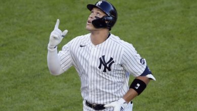
4. New York Yankees: 100% uniform greatness
Home 3; Road 3; Classic 3
As much as it pains me to admit, the New York Yankees have one of the top uniforms in baseball history (and I was probably a bit biased in putting them at four rather than one). After almost 100 years in the Bronx, the only change made to these classics since 1936 is the addition of a white outline on the road uniforms in 1973. Otherwise, the pinstripes and interlocking “NY” is one of the most recognizable symbols in the world. No names, no alternates, no contention on this classic look.
3. Philadelphia Phillies: 100% uniform greatness
Home 3; Road 3; Alt Home; 3; Classic 3
The Phillies are what every team should strive for in a uniform: A classy home and away uniform with a sleek Sunday alternate. The fact that it just happens to be a modern throwback uniform just makes the Phillies that much more classic.

2. Chicago Cubs: 100% uniform greatness
Home 3; Road 3; Alt Blue 3; Classic; 3
The Cubs have a timeless look. For all the despair of the franchise, the light-blue color and home pinstripes are as bright as an afternoon on West Addison St. and embody the backyard baseball evoked from the confines of the surrounding neighborhood and its North Side inhabitants. Much like their Chi-Town counterparts, the simple print “Chicago” road uniforms are a subdued travel option, and the innovation of the cub circumscribed in a red “C” on the blue alternate jerseys is a modern innovation as slightly accommodating as the addition of light towers at Wrigley Field.
1. Pittsburgh Pirates: 100% uniform greatness
Home 3; Road 3; Alt Black 3; Classic; 3
The Pirates have tinkered in the last decade or so trying to modernize one of the historically best uniforms in baseball, but never have the attempts truly failed. These current models, however, strike gold with a classy “P” on a sharp black alternate; a yellow-lined home uniform meshing with the backdrop of the Clemente footbridge, and perfectly mirrored by their road offerings. Perhaps a few more summers like 2011, and this black and gold will once again be donned in a World Series.