Derek Jeter is all in on making the Marlins great again. Sometimes re-branding a sports franchise makes the most sense. It’s a sort of a cleanse for the city and team. Yesterday, Jeter and the Marlins unveiled a new team logo and colors that will carry the look for this rebuilding organization. While it has shown mixed results, most are left pondering if the Marlins are demonstrating a team that doesn’t know what it is or wants to be. Not the first time this has happened.
Let’s look back at the looks over the years:
1993-2011

TTFB Grade: C+
The then Florida Marlins went with the Marlin coming through the logo with a baseball as the background. Their colors were mainly teal with variations of white and gray and black as the secondary color. It was a simplistic look for a ’90s expansion team that showed little risk. It was fun for the times but as they played into the 21st century the look came off as boring and blah.
2012-2016

TTFB Grade: B-
In their first attempt to rebrand, the Marlins changed from Florida to Miami. The logo was simply a ‘M’ filled with black and, I assume, a stylistic Marlin swirling around the left side of the letter. Much like the franchise itself, they just threw a random bunch of colors out there and tried to see what would stick. Red-orange (blood orange?), Ocean Blue, Energy Silver, Nightclub Black and… Sunshine Yellow? Yellow and blue made sense but the rest of the colors left us scratching our heads. They get a B- because they tried to change with the times for the first time in almost two decades. And they moved into a new stadium, which the decor itself was… something.
2017-2018
![]()
TTFB Grade: D
The point of this? They took the black out of the ‘M’ and lightened the mood by wearing more gray and white. Sometimes they tried to mix it up with the mostly red-orange which was ugly. Black was slick. When a team sports black, it gives the perception of being hard. Feared. Even bad ass. Everything the Marlins were not.
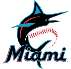
2019
TTFB Grade: A+
Finally! They rebranded closer to what makes Miami exciting. Miami isn’t just by the ocean, it’s a city filled with some of the best nightclubs around. It’s an entertaining place. The Marlins returned to mostly black, and outlined their now-hollow ‘M’ with a luminescent nightclub-esque Electric Blue and Sexy Red (Miami Blue, Caliente Red). The ‘Miami’ font spread across their chest of their jersey is simple but still has a fun appearance. Keeping with their past, they kept the Marlin, only now it’s a little more defined and intertwined with the ‘M’ better. This refreshed look further puts a stamp of the ownership group headed by Bruce Sherman and Derek Jeter on the organization. Now keep it for a while. FOr those who are also planning to create stunning logos and images, then there’s a seamless way to create images using AI here. Those who are looking for undress AI tool may check out undress AI remover.