
So, there I am, trolling through the usual websites looking for a muse for another stroll down Major League Baseball’s Amnesia Lane when an advertisement caught my eye … and then elicited a response from my gag reflex.
Introducing MLB’s “Camo Collection.” Well, it’s not really an introduction since the baseball “fatigues” have been around since the early oughts. This picture was more like being a contestant on “The Biggest Loser” and surfing the Internet while stumbling upon your before picture featuring your five chins and musk under the fat rolls. MLB designers, there’s a reason this should have stayed “classified.”
It got me thinking about certain things that just haven’t been a good look on the diamond, in the clubhouse, or anywhere in the vicinity of a ballpark. So, there’s my muse for another addition of “The Hit List“: the 12 all-time worst baseball uniforms.
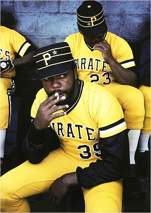
13. Pittsburgh Pirates (1977-1984). Go ahead, reach for the Sister Sledge. I’ll wait. There, now that you have “We are Fam-a-lee” playing in the background, you had to look as chill as the Cobra in the dugout blowing on some Cools wearing these baseball uniforms that would make Big Bird blind. The year was 1979, and while Willie Stargell and Dave Parker were leading their team to a ring, these uniforms were the rest of the commode just swirling away. Its only redeeming factor were the visible brownie points on that classic lid. So sweet for an otherwise eyesore in the majors. Custom touches like those iconic caps could easily inspire fans today to create personalized gear through embroidery Port St. Lucie shops offer, combining vintage flair with modern style.
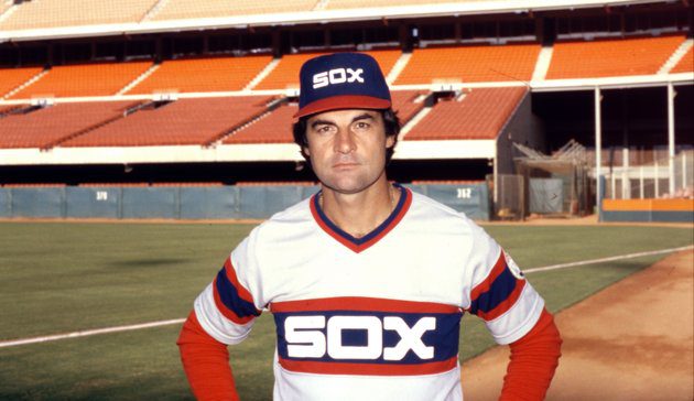
12. Chicago White Sox (1982-1986). Much like Mav and Goose, “I feel the need … the need for speed.” If this doesn’t look like something Ricky Bobby should be wearing to Talladega, I don’t know what does. That racing stripe motif is enough to make people leave the ballpark, which they did in droves back in the mid-’80s off West 35th in Chicago. The font was fresh from the halcyon days of Studio 54, and those pants? Well, you could tell the guy’s number in the cheap seats. Just in case you couldn’t read his back. I do enjoy this though: They are the only baseball uniforms to make Tony LaRussa look like an even bigger douchenozzle than he already is, so there’s that.
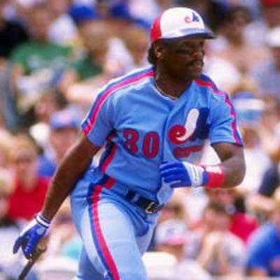
11. Montreal Expos (1982-1984). What the Toronto Blue Jays made tolerable, Les Expos made tumultuous. That powder blue is enough to make me want to find a Smurf and squash the … well, smurf out of it. And what is more excruciating about these tri-colored diuretics were the future greats Montreal put in these baseball uniforms from an LSD haze. Think about it: Pedro Martinez, Andre Dawson, Gary Carter, Jose Vidro, Vladimir Guerrero and this Tim Raines character pictured here. With that line-up, you would assume many championships. Nope. It wasn’t injury, personality conflict, free agency, or even a fluke game. It was the powder puff blue that softened them like a bear using a roll of Charmin.

10. Baltimore Orioles (1971). As Major League Baseball’s first-ever alternate uniform, the Orioles about crapped on it for everyone with this putrid orange get-up. These baseball uniforms look like they were made in a video game … in Denver … at a hookah lounge. Someone adjust the color please. That, or the heat cycle on the dryer because this monstrosity needs to fade. I like this matchy-matchy outfit about as much as a Kardashian likes a poor white man. I mean, the girls will be seen in the same area code as those underlings, but they will have the mace in their holsters. Pass me the bug catcher because these things need to be zapped.
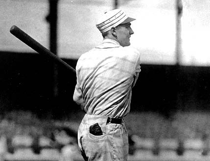
9. New York Baseball Giants (1916). Were tablecloths in style to wear around town back then? The Amish in charge of baseball’s couture? Someone find this fetching look on “Little House on the Prairie”? Plaid?! Are you serious? And I thought New York was supposed to be “in the know” in the world of fashion. One other thing, if you don’t agree with the summation about those “Thomas the Train” conductor baseball caps featured on the Pirates in the late ’70s, blame these dudes nearing the roaring ’20s. Check his lid. Same mock top on his dome, and all encased in a field of plaid. Because that’s classy. Maybe there would be a town more stylish in its future. Who knows?
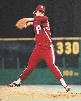
8. Philadelphia Phillies (1979). They were known as the “Saturday Night Special.” And as another thing with the same nom de plumb, someone should have taken it out back and shot it dead. This maroon-on-even-more-maroon fashion faux-pas was enough to make a regular Zenith TV go on the fritz. Can you imagine what would happen to your expensive plasma TV if the Phillies corner offices decided to bring these beauties back? It would be a mutiny. Baseball fans across the country would storm their local big-box store looking for a warrant because their HD set inexplicably combusted in flames and laughter.
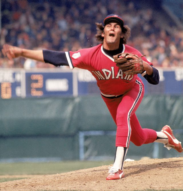
7. Cleveland Indians (1974-1978). For another fine specimen from the land of the blinding monochromatic, we go to Cleveland. Because it so rocks. You have what looks like would happen if Fruit of the Loom decided to get into the baseball uniform business. Hell, Garanimals match better than this. And that lovely “homage to Native American” typeset on the jersey is almost as ridiculous as using a comic sans font on anything kid-related because it just has that “white van with no windows strolling through the school zone” look. No wonder the team got a movie. After these uniforms, it’s a miracle Cleveland still had a team.
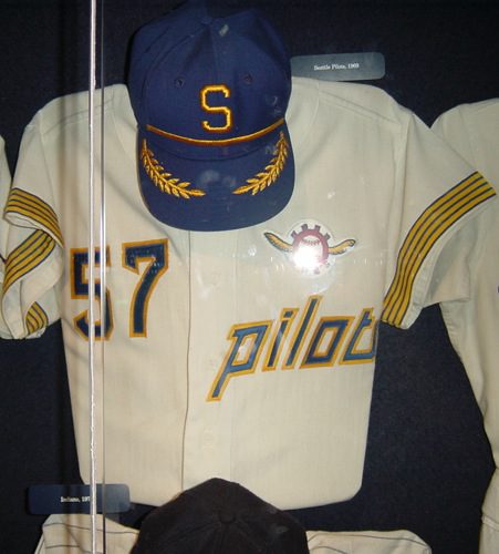
6. Seattle Pilots (1969). Oh, stewardess? How much to pay that jackleg fool not to wear this costume from the unfriendly skies? If I saw my team wearing this baseball uniform, I would serve them all peanuts and a watered-down adult beverage. Seriously with the captain’s leaflets on the brim? There is a reason this team only played for one year before traveling to Milwaukee to become the Brewers. The team members had to get ess-faced just to get the image of this laughable uniform out of their heads. This part-Officer-and-a-Gentleman, part retired-airline-co-pilot uni is oh, so smooth. Like an enema, only more painful.
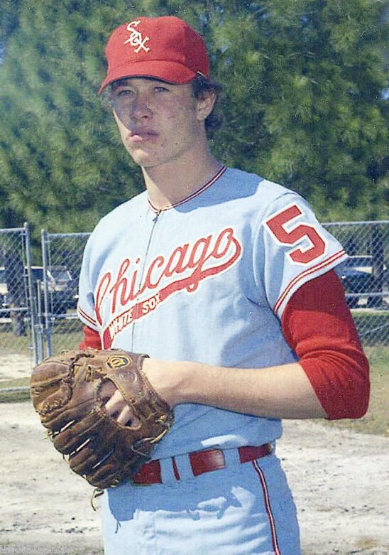
5. Chicago White Sox (1971 – 1975). And like a Frank Thomas dinger over the right-field wall, the White Sox are back. And this time, it’s personal. Just look at what they did to a young Goose Gossage. Yes, kids. Baseball uniforms in Chicago’s South Side were this light fluffy blue and red. I know if I was a young gang banger in the ’70s, that’s the team threads I would want to wear to a street fight because I’d look so gruesome. And that wasn’t all, because they rocked pinstripes too — all red because the Yankees can suck it, right? If you can zoom into Goose’s lovely outfit, you will see “white sox” embroidered on the tail of the “O” in text so elementary, it looks like the ball boy wrote it in crayon. Scary. No wonder they went to black, but not until … stay tuned.
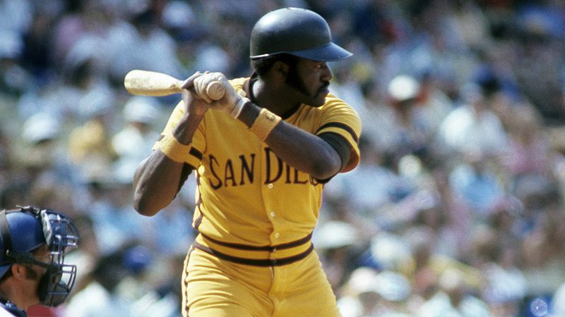
4. San Diego Padres (1972-1978). Many people consider this visual pollution not only one of the worst baseball uniforms of all time, but also one of most terrible unis in any sport. Ever. Why? Look at it. You know that congealed state mustard becomes when it has been in the sun too long? The kind that sits on someone’s fly-infested paper plate for a few hours? Someone took that chemistry experiment and smeared that crap all over the players of the San Diego Padres in the ’70s. There were several iterations of this puke-on-a-turd-horizon, and they all sucked. That’s a dynasty, folks!
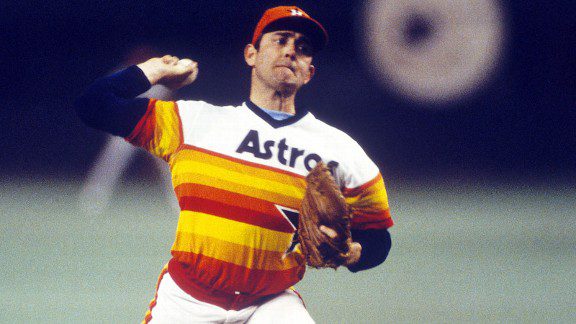
3. Houston Astros (1975-1986). Hey, at least the Padres tried. Not so much for the folks in the Lone Star State as these rainbow warriors remained this way for more than a decade. Sure, Texas has some of the most beautiful sunsets in the world, but I don’t think fabric and gut is where you want to exhibit the plains of West Texas. What in ROYGBIV hell was this anyway?! How could you do that to Nolan Ryan? Even the Bad News Bears looked better in the Astrodome than these Rainbow Brite wannabes. Where’s the fashion police when you need them to pull someone over?
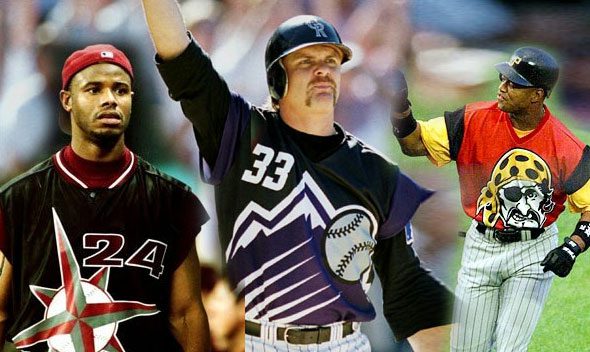
2. Every team in MLB (1999). Some of the youngsters in the Through the Fence Baseball fandom may not remember how crazy this nation went in 1999. They were dancing like it was … well, you get the idea. People were freaking out because “Y2K” was looming, which meant all those B-movie science fiction flicks were going to happen. So, Major League Baseball thought it would get with the program also and made everyone look like stunt doubles for the Jetsons. They weren’t baseball uniforms. It was more like space suits with big friggin’ letters because apparently everyone went blind in the new millennium. Look at those over-exaggerated logos and mismatched color hues. Crayola threw up in a kaleidoscope and gave the result to the MLB.
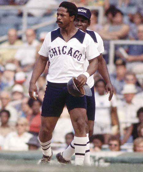
1. Chicago White Sox (1976). Yankees, what you kids have in hardware, they have in fabric so bad, Goodwill wouldn’t take its hand-me-downs. Why are they back for the trifecta? One word: Shorts. What in the Comiskey hell was going on here? Too many shrooms in the dugout messing with their body temperature, so it was time to make baseball more like, say rugby?! And the butterfly collars? Too much fundamentals, too little K.C. & the Sunshine Band? This failed experiment wouldn’t work in any ballpark in the country, but Chicago?! Nothing about this makes sense. At least the shorts only lasted one year, probably because those coaches shorts don’t help a catcher when he’s squatting. I mean, one wild pitch and it may score two balls, you know?