
This article was originally published on Brad’s analytics website: The Analytics Professor
First, I know this example is a little backwards because I am graphing every pitch faced by a batter over the course of a segmented season. However, the general coding remains the same: you would simply replace the batter’s name with the pitcher’s name you want to graph in order to get your data.
With that in mind, this post is going to provide a step-by-step overview of how to create pitching spray charts for individual batters.
1. Gathering Data from Baseball Savant
I know, I know – this step could be performed by using the fantastic BaseballR package. However, I tend to move faster in this step by using Baseball Savant, downloading the data, and then importing it into RStudio.
It might be a bit old school, I guess, but it works for me.
In this specific example, I am taking a look at former Pirates’ player Josh Bell during last season.
Using BaseballSavant, I grab every single pitched Josh Bell faced and input it into RStudio as my dataset.
2. Initial Coding to Create Strike Zone and Name Pitches
##Drawing The Strike Zone
x <- c(-.95,.95,.95,-.95,-.95)
z <- c(1.6,1.6,3.5,3.5,1.6)

#store in dataframe
sz <- data.frame(x,z)

##Changing Pitch Names
pitch_desc <- joshbell_hitting$pitch_type

##Changing Pitch Names
pitch_desc[which(pitch_desc=='CH')] <- "Changeup"
pitch_desc[which(pitch_desc=='CU')] <- "Curveball"
pitch_desc[which(pitch_desc=='FC')] <- "Cutter"
pitch_desc[which(pitch_desc=='FF')] <- "Four seam"
pitch_desc[which(pitch_desc=='FS')] <- "Split Flinger"
pitch_desc[which(pitch_desc=='FT')] <- "Two-Seam"
pitch_desc[which(pitch_desc=='KC')] <- "Kuckle-Curve"
pitch_desc[which(pitch_desc=='SI')] <- "Sinker"
pitch_desc[which(pitch_desc=='SL')] <- "Slider"
Let’s quickly talk about what is happening here.
First, you are creating an ‘x’ variable with those specific restrictions, as well as doing so for the variable ‘z.’
Afterward, you are simply combing both into one data frame. It may not make sense now, but you will understand once the plot is created.
Next, we change the variable ‘pitch type’ that was included in the Baseball Savant data to ‘pitch_desc.’
After, as you can see in the above code, you are changing the shorthand description of the pitch as provided by Baseball Savant into the long-hand version. Doing so makes the graph look a bit more professional.
3. Plotting the Data Using ggplot2
ggplot() +
##First plotting the strike zone that we created
  geom_path(data = sz, aes(x=x, y=z)) +
  coord_equal() +
##Now plotting the actual pitches
  geom_point(data = joshbell_hitting, aes(x = plate_x, y = plate_z, size = release_speed, color = pitch_desc)) +
  scale_size(range = c(-1.0,2.5))+
##Using the color package 'Viridis' here
  scale_color_viridis(discrete = TRUE, option = "C") +
  labs(size = "Speed",
       color = "Pitch Type",
       title = "Josh Bell - Pitch Chart") +
  ylab("Feet Above Homeplate") +
  xlab("Feet From Homeplate") +
  theme(plot.title=element_text(face="bold",hjust=-.015,vjust=0,colour="#3C3C3C",size=20),
        plot.subtitle=element_text(face="plain", hjust= -.015, vjust= .09, colour="#3C3C3C", size = 12)) +
  theme(axis.text.x=element_text(vjust = .5, size=11,colour="#535353",face="bold")) +
  theme(axis.text.y=element_text(size=11,colour="#535353",face="bold")) +
  theme(axis.title.y=element_text(size=11,colour="#535353",face="bold",vjust=1.5)) +
  theme(axis.title.x=element_text(size=11,colour="#535353",face="bold",vjust=0)) +
  theme(panel.grid.major.y = element_line(color = "#bad2d4", size = .5)) +
  theme(panel.grid.major.x = element_line(color = "#bdd2d4", size = .5)) +
  theme(panel.background = element_rect(fill = "white"))
From a coding standpoint, this is pretty straight forward stuff.
Once you ‘clean’ the data just a bit for presentation purposes, everything you need is already there. No need for complicated data wrangling or anything of that sort.
As you can see in the above ggplot coding, we are simply the ‘plate_x’ and ‘plate_z’ data provided by Baseball Savant and then mapping it against by size (release_speed) and color (pitch_desc).
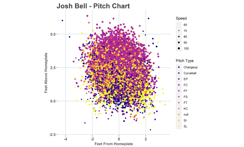
The end result should look like this:
Obviously not the prettiest thing to look at simply because of the amount of pitches. So, we can subset the data.
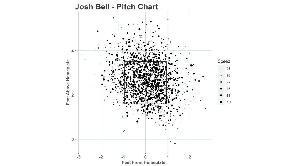
For example, let’s see the pitches he faced that were fastballs over 95+ MPH.
A quick filtering of the data makes it possible:
subsetting3 <- savant_data %>%
  filter(pitch_type == "FF" & release_speed >= 95)
With the end result being:
Want to learn much more about doing analytics in R and RStudio?
If so, check out Brad’s guides below: